17 May 2013

Random Update


Long-time no blog


Good arftanoon.  I have realised that it has been a while since my last blog and thought I could give a general update.

Group project = Great fun, very challenging.  I’m not going to go into some massive rant about how some of the team took the piss and were unreliable and probably a hindrance more than a help, but that is of course the case.  Anyways, I made a fly-through.  I structured it so each team member has they own section, and tried to ensure they each make sense and relate to a location (often using our helicopter for positional reference).


Here’s our level in youtube form              Is five minutes but has creepy sounds and the like.

I guess I’m glad I learned the recording process (handy for FMP maybe).  I actually made it so the level is playable, and so it also auto-loops the flythrough – Making it suitable for the end of year show as I’m aware there may be a spare console or two.  This involved using Adobe After Effects to compile the images and audio, and Audacity to actually record the sound.  The easy way around this is to render in game – but this lags and looks shitty.

Loads of shared map-space means more available pixels for detail

I did the Lockwood test thing the other day, not for a placement but for the modelling practice.  The test is to make an antique sofa (3,500 tris and 512 maps).  I pushed myself and got it done (nicely) in twenty-four hours.  I did a lot of map sharing and actually used the most basic modelling techniques I learned last year.  

I think I'm getting better at 3D in general - Detail density can be manipulated or should I say used efficiently - What I tend to do is have big bold shapes on the edge, then more detailed crap on the inside.  This works well as you see the sillhoutte from a distance , but also want some eye candy when you draw closer. 
I gave the patterned trim (and head-piece) a lot of space so it looks clean even close up

In a way I am trying to go full circle – the amount of crap I had to make and remake, and repair for the group project was a lot…  So now I’m just looking at getting stuff done – nicely, quickly and efficiently.

This week I enrolled to an “Art Camp”.  It’s an online course created by an established concept artist named Noah Bradley.  I’ve been getting into the habit of working sixteen hour days, last year over the holiday I relaxed too much and hardly did any work.  I have been feeding the teachings and syllabus from this course (£135 for 12 weeks online course) to our facebook.  The course structure is quite similar to ours but the workload is crazy – Week one “Masters Studies” = 50 tonal studies, 50 colour studies, 3 finished studies.  There is a fine line between learning and rushing, and holes in his teachings – although he supplies a decent two hour guide/tutorial each week.  Noah has requested the tonal studies be solid and 3 tones – It is impossible to break down many images that way without detailing/rendering.  This workload takes the piss really, but it’s do-able for me (I have relinquished my life for now) although it is like a full-time job on top of everything else.
My mess of thumbnails so far - Different compositional elements require different attention/approach 

In the mean time I have been generally trying to soak up as much art stuffs as I can.  I have been following and liking a lot of stuff on facebook – I have even been watching random live streams of artists while I work, and a lot of Law and Order SVU (dual monitors).  Theoretically I have been working through any “breaks” and my real breaks are to bathe, socialise and sleep.  I still don’t really like concept art I’m afraid, but I can appreciate it.  From watching pro artists live I can compare my technique at least and I’m confident my strokes and artistic eye are pretty good.  Since starting this art camp I can see why lots of my images are “weak” – I have respect for this Noah Bradley dude (more for his teachings than work) one thing he pointed out already is that concept art is about a “quick read” – Where I see stupid over-the-top “studio-esque” lighting & materials, unimaginative compositions and rim-light everywhere it’s all for the viewer to get an easy read.  To be honest I’m not too sure this is the way art should be going (I think I had a massive rant about Avatar in a post somewhere) I think people are dismissive enough already.
A random picture I did last night to break up the work - Probably needs more dramatic lighting.. bloom, rim-light, lens flare, focus blur, motion blur, wood texture and a flock of birds - hehe.  Seriously though I considered smoke as a narrative aid - escape from burning location... Exiled maybe

14 Mar 2013

Realism


“Realism”, it’s not just a genre of art.  If you search the internet you will see the word “realism” applies to many different fields – arts, politics, philosophy…  Anyways, I guess I am writing to reflect some things I have realised on this course.

Talking among the cohort I can feel a definite divide – Those that have and those that have not.  Have what exactly you wonder?  It’s hard to define, but can be seen in our grouping in the team project.

One half of the class decided they didn’t want to work with others and formed their own “super groups”.  This causes problems… for everyone else.  It’s such a selfish and unprofessional approach, yet it was allowed only adding to the divide.  It’s making one side more and more cynical and the other more confident.  It’s basically the same with the allocation of teaching – The [Insert students name here] simply get more encouragement and attention from the tutors.  It’s not those guys that need the most help.  Let’s say that the groups doing the London project are the positive, “get-more-attention-y” ones and the “left over crap” is doing the local queens building...  Interestingly out of choice - possibly being less ambitious and sub-dominant.  I have found in my team people are reluctant to take on responsibilities, I think through possibly lack of experience and encouragement.  The tutors should be empowering these people, not ignoring them because they are harder work or because they are less likely to immediately produce work to entice the next batch of students.

Morlocks from the book "The Time Machine" - a fictional product of the divide in society 

Failed Diplomacy

It's worth noting that the term “realism” when applied to politics refers to the realisation that the gouverning bodies and individuals are ultimately self-serving.  When team “pudding lane” (great name by the way) gave their presentation there were ensuing discussions and constructive feedback on how to best go forward with the project for at least ten minutes with all the tutors.  When our team the “Dirty Ngons” (great name by the way) made a presentation I personally had to ask for feedback and critiques.  Unfortunately (I can’t truly say for what reason) the tutors seemed… bored, uninterested and our feedback was under a single minute.  On one hand I think it’s great doing collaborative projects which will undoubtedly raise our profiles, it would be a lovely experience too I’m sure.  But on the other hand moral is so damn low for the other half the class that you guys should be making efforts not to show favouritism… Maybe learn the faces of some students you’re not sure about… see what drives them, understand their personalities.


My problem is that I have paid just as much for my education as the members of team London – Showing no interest in other teams is demoralising for them (but I guess the “Londoners” don’t care, right?).  There have been many discussions and much whining and bitching among this half of the class, while the other half demand tablet pens.  The main issue is course delivery – It’s lacklustre at best, with little to no teaching of theories and techniques… I often get the feeling we are feeding the tutors with information (not the other way round).  On the DMU foundation course I was encouraged to experiment with frequent personal feedback, & taught skills within Adobe packages (optionally). on this course I am encouraged… Nothing.  I guess I’m supposed to look towards the students that get coverage and aspire to that?  We all know the proverb “give a man a fish”?  Well this is Chinese proverbs gone mad.
PS4 due for a Christmas release - Next gen is on the horizon - Are we prepared?
The game industry and technology is constantly evolving.  You can’t use comparatives that are ten years old like Half-life 2.  Sure it’s heralded as one of the best games in in the past decade, but it is dated as fuck.  In my opinion all of the classes and the syllabus as a whole need a rethink.  At the minute coming into lessons is a hindrance to my learning – Not only are we showed very little and can learn more from a video tutorial on YouTube, but the punctuality, organisation and attitude is a bit demotivating.

I said it this week talking in a group of others.  I said I feel like I was scammed.  This course on appearance has great work to promote its self, and a course leader who is a strong/confident speaker.  I naturally assumed that the quality of work was a reflection of the course and its teachings.  I remember coming in and talking to students before I signed up.  There was a guy called Jake (I think it was Jake?) who wasn’t the strongest drawer, but he had a piece of work that inspired me to join.  It was a canal pencil sketch from year 1.  What impressed me was the improvement from his first attempt to his final.  I thought “wow!  If this course can teach and inspire the change from pic A to pic B then there must be something magical here”!  Unfortunately I have come to the realisation that he took a photo of the canal and copied it at home.  Jake didn’t learn anything, copying from photos in my own time I could produce a photo-realistic(ish) image – I don’t really enjoy it and wouldn’t learn Jack Shit.  That’s not even art in my book.  If you’re a writer and copy other’s words what does that make you… a scribe?  If you are a teacher who  can’t inspire, inform and help students what are you… Too busy?

This blog is in no way a personal attack on any students or tutors.  I quite like the tutors and can empathes somewhat, and I am proud of team London.  Any problem is only a problem when you can’t overcome it.  That’s why I write this.  I’m considering trying to perma-work at university, although I have often found the other students collectively annoying & disruptive.  It’s not them it’s me – I have actually grown to like the “alternative” crowd – or the dark underbelly, that are reserved and disillusioned like me… I even got an invitation to a party last night.  It’s easy to lump people together though.  You, me, them, us.

Saigon, I’m still in Saigon

Realism of course also refers to an art discipline/style.  I actually learned loads of art and stuff before I joined this course (sorry for the bitter stab there).  Realism was of course before cameras and is the art of realistically representing the surroundings around you.  A good realist painter would also show a reflection for their society (while an expressionist may reflect themselves or their beliefs).  This is a big thing when it comes to concept/modern/digital art.  People like realistic light and shadow, proportions blahblahblah blah complimentary colours, blahblah shiny surfaces & reflections.  I subscribed to six months of Imagine FX and they keep sending me the damn things.  Digital art is a bit of a shortcut – I’m hoping that one day the internet will become sentient and try to destroy humanity and all we have left is charcoal and rubble to draw with.  Seriously though there is an extremely small percentage of students who even use their own digital brushes, although there are YouTube tutorials to tell them how to do it!  On top of that there is a lot of paint overs (I can see through a lot of work), copies/interpretations of other artists work and references without crediting the source.  On the whole a lot of “monkey see monkey do”.  There are some strong individual styles among us, but also a lot of comfort zones.  I have seen one student in our year draw the exact same looking character a hundred times.  Another using the same palette they had before coming here.  Are these the elite?  I was hoping for the next stage in game art – cutting edge techniques, solid foundations provided by our syllabus, a variety of styles explored and encouraged…  Nope that’s not happening.

I guess we all have different expectations.  Looking at my own work I guess there is nothing great or unique either.  Am I being hypocritical?  Hypercritical?  Yeah, of course I am, but I’m trying to state my thoughts on quite an important issue.  In my review I said I was feeling that I was getting “over saturated”.  Maybe it’s a personality thing, judging from our mini-talks on our personal inspirations, others are genuinely enthusiastic about artist A or artist B…  I don’t feel that.
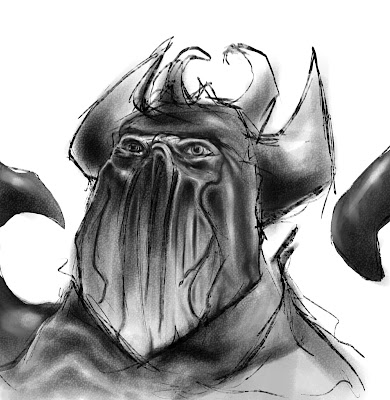
A doodle I started but gave up on after 10mins today - People don't seem to care unless using popular techniques and over-rendering.  Should I spend more time adding detail I personally don't need/want to see
I went to the Louvre a while back and I stared at the Mona Lisa for a long time, as an artistic chap I had no choice.  I appreciated it a lot more than any other version I have ever seen and is hard to compare to book prints and digital images.  I’m not a Da Vinci fanatic.  I have a couple of books on Da Vinci, this doesn’t mean that I want to copy his images or style.  Art for me isn’t something you can copy and comes from within.  I’m not concerned about taking the fun out of the work – I have done paid work for half my life.  Earning a wage and art simply don’t go together – Having to do something day after day removes the excitement, just look at war vets who have done multiple tours – I bet they don’t get the fear like a rookie would.  In fact they may even become “war hardened”, emotionally detached, possibly broken.

A Kid in a Candy Store

It’s the Way of The World

Being a post about realism I guess I should be noting that the conditions mentioned are a pretty accurate reflection of life.  Things aren’t always going to be ideal & the grass is always greener.  There will always be sycophants and dicks like me who just moan without solutions.  It’s easy to blame the conditions around you or a situation you are in for your own discontent.  At the end of the day it don’t really matter.  Just get on with it.  I’m actually happiest absorbed with learning stuff - be it 3D modelling, a new and interesting person/relationship, or how to outwit opponents or the system in a video game.  I might be a bit jealous with the attention thing – I’m pretty sure the students that get the most attention are not getting as much as they would like either.  I have also been in a few different jobs where it’s not how good or hard a worker you, but how much the people with influence want you around.  There is a whole world of back-scratching in all jobs and industries and I think I have to learn an important lesson about diplomacy myself.  It’s actually going to be a bit of a break-through posting this – I think after I spit this poison out of me I can start to recover maybe.  I have wrote several posts but never sent, all with a similar theme – me losing my way and being bitter n twisted.  Well I hope it’s come across a little less bitter and a bit more critical and possibly informative.

10 Mar 2013

State of the Art: pt2


It’s been a busy period for course work recently, mainly because I’m making up for a lazy January but also because of the group project and deadlines coming up.  Well, on top of all that I’m getting a bit sick of concept art, I have been looking at more and more digital art to help me stay enthusiastic, and has helped me to stay interested… somewhat.

Facebook is actually pretty good to get stuff shoved in your face without tracking it down – Just like some sites (ie cghub, deviantart, concept art world) and they will post loads of images, doing their best to promote the artist and the site… It’s a mutual back scratch.  A good example is the artist Anthony Jones – he is heavily active on facebook and a comment from him can boost interest from his fans and people that follow, in turn he often gets “editor’s pick” on CGHub – This helps cg get more attention from followers he has already and adds more that will see him through cghub.  In a way it is similar to cry dev – I never really visited their site until I knew people getting a mention on it, it’s the networking circle of life.
Anthony Jones - a popular digital artist

I have been making “artist” folder for my favourite artist’s websites… I have fifty so far.  From what I have seen I like the more natural looking and “painterly” art.  The content is unfortunately beyond cliché’d now – Assasins don’t all wear hoods and have emo tendencies.  I have been trying to understand what it is that appeals to others – Not just with the content, but also with the compositions, mark making and realism.  I have noticed artists have niches, the aforementioned Anthony Jones has a knack for recreating nice and realistic surface material properties – using highlights subtle/over the top bouncing colour to bring his work to life. An essential skill I think for a good digi-artist would be combining this with accurate tones – which he also does really well.  I’m not too sure if I like all this, but the art is good and the artist shows methods and broadcasts live.
I’m a bit of a cynical guy, but the concept thing is little cliché’d… over the top lighting – everything is always lit as if in a studio.  Which annoys me with films even now – the camera angles and scenery are all VFX and films end up looking wrong.  
 
Gary Oldman - just a Jack wannabie.  Notice the background - this is about as big as the set seemed throughout
Today I watched The Book of Eli, which is a decent film I would say… apart from the VFX, the camera angles were too static on the long shots, everything seemed cramped right up to you even though it was supposedly a vast wasteland.  Sometimes you can just feel the blue screens.  There is a lot of turmoil in the VFX industry and I think they can go fuck themselves – what happened to the special effects, sets and props, location filming & bringing wealth & interest to other places… puppets & decent animation?  I also watched I Am Legend the other day (to maybe help with our group project theme) and the one thing that ruined that was the VFX.  It’s no longer being used because it is needed (Terminator 2) it’s being used because it is cheap and easy.  Most of the time the work is out-sourced and the employees don’t get any credit and don’t really care about the work.
Ang Lee caused some controversy at the Oscars this year and ruffled some feathers

20 Feb 2013

Control Freak

Hello. I’m writing a bit of a quick one today… I’m trying to take control myself and make up for lost time. I did practically nothing in January, but have been a little more on track and pretty determined since. Anyways controllers for games!

Controllers for games seem to evolve considerably with each generation. “Back when I was young” my primary controller was just a keyboard, there weren’t even mouses so we had both hands on the keyboard. Instead of the now standard WASD (up, left, down, right) layout often used OP was (left and right) QA (up & down) and space bar to fire (you never needed more than one fire button).

If I wanted to use a joystick on the Spectrum it would involve and adapter, which looked like a little brick. And for some reason joysticks would have many fire buttons, which all did the same thing (ambidextrous I guess?). I actually remember my oldest bro making me a joy "box" – a wooden cube with simple trigger keys hooked up to the pad cables, this enabled me to play like I would on the keyboard away from the console. Since then controllers have progressed too much – we can use our own 3D space with body gestures through the Kinect, which is a step up from 2D camera sensors like on Sony’s Eye Toy. What I think is much more practical are touchscreens and styluses.

Here’s a snippet from the Wii-U packaged controller from the Currys site
“The GamePad offers smooth controls with a built-in accelerometer and gyroscope for totally intuitive motion control. The left and right sticks can be moved in any direction or used as buttons.
An NFC touchpoint enables contactless data writing and reading to and from special cards. The Home button lets you select from Wii U applications mid-game, and there's a TV control button too.”

If the big companies smartened up and loosened their mobile licencing we could see mobile phones be used as decent controllers for many games and incorporate them a lot more efficiently. One of my favourite controller memories is playing the Legend of Zelda the four swords on my GameCube four player. It was cool because you can plug in your Gameboy (which were cheap by then) and actually play on the Gameboy and separate from the other players. In versus this is vital for ambushes and in co-op it opens up exploration possibilities for multiplayer puzzles… Pretty clever and fun too, appealing to a wide audience (if not the focused gamecore) – That’s Nintendo’s trade mark, they make fun games and pioneer controllers.

The Nintendo DS - Is also a controller
Take the Wii Fit for example. I was working at Game one Christmas where the Wii Fit would sell out every day. It wasn’t the World of War craft greebos, or the Fifa, CoD, Bio Shock masses that were buying them. It was women, lots of women of all ages. This controller was more of a “get fit” marketing scheme, but it worked. Nintendo excel at finding gaps, and broadening the market. Nintendo aint so cool compared to an PS3 or Xbox, but we aint all 10-30 guys.

Another one of note is the Nintendo DS – There are puzzles in say Zelda: The Phantom Hourglass which would incorporate both screens (one being touch screen), the microphone, and even the closing of the two screens (that puzzle stumped me for ages).

Talking about marketing to women & kids I guess I should mention Sing Star. Disney Sing Star. Soo many Sing Stars. I’m not a big fan of it, but I know a few ladies that do like a good old' sing, especially after a few drinks. That also leads on to Guitar Hero and Rock Band… Being a real drummer and playing in actual bands I haven’t met any musicians that approve of it… Apart from the one that actually work with Activision who help tab out that crap. And he’s a git.

Dance mats – No No No No No. These in my experience are just bad. You get dance mat ninja’s, and I’m sure it’s great fun and good exercise, but not practical for the average work a day chump.


Dual shock 3 - The only drawback are the triggers... which suck balls
One of the best console controllers I know of is the Sony Dual Shock. It was the first joypad to successfully incorporate dual analogue sticks (single ones have been around for ages in flight sticks, and pong was analogue but with a pot/knob controller I believe). When it was first released in 1997 not many games used the new technology, it was mainly a gimmick to rotate the camera in say Final Fantasy 7 which was a massive release. Since then it is established as the gaming standard – giving the player many degrees of control where there was previously one. This means we can choose the pace to run and turn, opening up the variables massively to give the players a more fluid and intuitive experience. Microsoft have adopted the dual analogue joypad, but the pad sort of sucks – it’s not as ergonomic for my big hands, and for some unknown reason they have the worst Digital pad I have used since the game cubes dumb ass effort.
Asymetrical analogues and an awful digital pad made this joypad kind of suck - Although you do get used to it
Talking about digital pads! I was a massive fighting game fan, and have just about every title on Xbox (until I started uni), and also have a passion for retro gaming so I splashed out and bought a top-of-the-line joystick. This is no ordinary crappy joystick you get from Mad Catz or Hori. This joystick is made from official Sanwa parts – Who are a Japanese company that make all the best arcade parts. Not only is it super accurate and responsive, unlike the Tekken wireless joystick released at the same time which had a delayed input. But also all the parts are standardised and actual arcade parts which are easily available to buy online. I even went super geeky and replaced the “gate” which controls the flow of the joystick from 4-way to 8-way – This means that it will accurately and consistently only go direct to the angles needed for the input. When I received it my eyes lit up – even the packaging was special, with a magnetized display cover. The best thing about this joystick is that it is USB – it works straight away with PCs, and I can play arcade games on my PC among others – It won’t become obsolete too soon.

Last year I went all bling and bought myself a fancy gaming mouse and keyboard even. I usually stick with the industry standard Microsoft ones I have used working in Banks, think are the same as ones in lab even. Anyhow the best thing about this new keyboard is that the keys are lit and I can adjust the brightness to suit my mood. The mouse is actually decent and useful (is a Naga MMOG), with number keys on the side, which have become invaluable to navigate 3DS max and playing games – I could program them to do common tasks in any program, but most are easier with the keyboard anyway. Another handy function is that it’s super accurate – allowing me to crank up the sensitivity and making the most of the small space I have for it.

Sorry – Turned into an epic. But to cap I would say that ultimately it doesn’t matter what platform you are using – we all want a controller that is easy to use, intuitive, and reliable. There are specialist avenues you can go down, but ultimately there is an accepted standard. Most people I know don’t care for a Kinect or anything where you have to move more than their hands, anything outside of this to me seems gimmicky, but we all like a gimmick every now and then.

23 Jan 2013

Music in Games… A little history


Yay! Sounds are awesome and have as many functions as images in games. Back in early gaming the sounds were not present, but when they were it still kind of sucked. On my old Spectrum 48k the games had music and sound effects but there were a few major differences.

Bitrate - The quality or resolution of the sounds created.
Channels - The number of simultaneous sounds that can be made in an instance (spectrum=1)

In the 80s and early 90s game sounds evolved from blips and screeches generated from on board sound chips to the universally recognised General-Midi (GM) modular sounds. I'm a bit of a student of music and can tell you MIDI has applications even outside of sound, during stage shows lighting rigs for example use MIDI to transfer digital information about the lighting – colour sweeps and washes and the like. This totally automates the lighting desk process… Which I thought interesting anyway.

General MIDI (GM) revolutionized gaming music and effects. The way it works is that it has a general library of sounds, piano, harp, strings, padding and the like. It also contains many basic modifiers, like volume, panning, vibrato, pitch bend… These are then used as a virtual orchestra and anyone with fundamental music skills (and a bit of patience) can use these to recreate an almost infinite range of audio sounds and music. The great thing about MIDI is not only that it is universally used, but the amount of data needed to store and edit these sounds is miniscule.

A while back I took apart a MIDI track from Zelda: A Link to the past, which was on the SNES, I think it is amazing how complex and subtle the composition is. Although it sounds melodic and almost tranquil there are hundreds of notes and modifiers, unfortunately I can't show it the way I wanted, just take my word for it that game music is deceptively simple. Lots of music in games is made to loop, as the gamer may be playing for an indefinite amount of time. There are also instances of the tracks changing as you enter a different area or an event happens (often by layering/changing tracks and samples along-side original tracks).


One game that I think deserves a big shout out for the music and sounds is Grand Theft Auto. In San Andreas the music is actually played as the radios in the vehicles you steal or the sound systems at the locations you visit. On top of that they use real tracks that suit the era and have humerous commentary. You can also switch the radio stations according to your musical tastes, on top of that there is a progression as you play further, and the announcers even comment on the news – which may involve the plot and the actions you have taken. How brilliant and immersive is that? I've not even mentioned the best bits which are the incidental comments from the NPCs (non-player characters), these are epic, rude, and often hilarious.

Reading the brief for this task I was surprised that "Good Times" was the most sampled song. I have been brought up to believe the "Funky Drummer" is the most used sample (drum loop) – being used in hundreds of dance, hip-hop, soul, drum and bass, and jungle tracks. Personally the biggest gaming music moment for me was Final Fantasy 7 (1997), with epic and original orchestral compositions, which I would say comparable to John Barry of cinematic fame. I actually have the Final Fantasy soundtrack… which I admit is really pretty sad. There is an interesting genre of music called 8bit/chiptune – with bands like Anamanaguchi using actual Gameboys on stage along with traditional instruments… which can be grating on the ears or melodic, is hard to tell - but is an obvious tribute and evolution of game music.

17 Dec 2012

Texturing: nDo2 vs Crazy Bump


Today I downloaded the texturing script for Photoshop called nDo2. It works in conjunction with Photoshop and can help generate normal, diffuse, Ambient Occlusion, and all that. I did a little experiment with an unprocessed photo in my personal library. I'd normally tweak images before attempting the creation of normal maps – This involves manipulating the grey-scale values on several adjustment layers and painting/adding and using the existing image to create a height map. Even explaining it takes long.

In nDo2 I picked from a list of typical texture types – "Sharp Brick" in this example. After that it took about a minute generating loads of layers in Photoshop to create a normal map – The default was pretty good, and guessed well for the specular and gloss even. Great! After it has the normal it can be adjusted and refined (working within Photoshop linking to the active file), a bit like you can in Crazy Bump (with a lot of copy & pasting). There was a little difference in quality between the two.


nDo on the left and Crazy Bump on the right.  This is the preview after opening a plain old photo of a wall.

Also I tried converting the normal map into a diffuse – This actually worked out a lot of extra detail from all of its equations creating the other maps. Feeding this back over the diffuse and overlaying gave a much more interesting and rich texture. This would be handy for adding detail and variety to maps easily as a basis to work off. The whole process is so much easier, although I do have a moment of sitting around idle (was a large image to process). nDo2 is also prone to crashing – any cancellation of the process messes it right up – So experimenting can be time consuming. To compare the two isn't really fair – Crazy bump is a dinosaur in comparison, although is pretty quick and easy to pick up. Using the two and converting different maps between each other might be interesting, I did give it a go but I think Crazy Bump really needs a height/normal map to be of any real use. nDo2 cuts the height map process out somewhat, and there are loads of tricks I haven't even explored yet.


Here on the left I combined the diffuse generated from the normal map settings I had from nDo, on the right is the unprocessed photo .  Noticed lots of the subtle detail is more apparent?  Getting these selections manually would be improbable (I would probably paint it) and this is a nice quick way to acquire and customise detail, with the added bonus it will match great with the normal bump map.

When comparing the two you really have to consider the availability and pricing. They both have a free 30 trial, crazy bump for students is £30, nDo2 is £60(£48 on offer for Christmas). I have no problem paying £48 for nDo2 as it is worth it just for the few features I have used today. Creating normal maps can be a drag – You can project geometry within 3DS max, create & convert height maps in Photoshop etc, and project/bake from within 3DS Max, possibly importing from programs like Zbrush. 

nDo 2 can be useful for all of these examples – Enhancing these maps and even creating pretty decent diffuses to start painting on. When you cut out the monotonous and time consuming processes everything flows a lot better. There are no short cuts for many processes, and you have to really know stuff before jumping ahead and not really understanding the fundamentals. For example I used the preset "sharp bricks" in nDo, but I'm aware of how to create my own presets and my learning so far will help a lot.  On top of that I will have to be creative with the layers that are created still, I just now have more options thanks to nDo2 and more time to do other things.

Composition: The Eye of God

Hi, I was thinking a lot about composition recently. Mitch Small posted applications of a compositional tool Facebook recently.  It was the "root 5" grid... I'm not going to get technical, it's basically the golden spiral/rule of thirds rotated 4 times around the image, so there are four event horizons/infinity points are whatever you wanna call 'em... I personally like using the word "infinity point" - It kinda makes more sense to me.
Here's a picture of Mitch's overlaying the root 5 grid.  The colour wheel has a Gamut triangle -This defines the available palette (before he whacked on some adjusments).  Here I believe he used it to colour areas to match the planes how the light & shadow would fall (green from above, blue shadows from the front/dropped by the green source).

 part of what I'm writing about - not the numbers or theory - Not the how, but maybe a little about why.  I looked around google and found this site, I personally don't work with mathmatical formulas, I see patterns - This is what it's about, the calculations were written after the fact to try and understand how our mind's eye sees.

If you have the chance watch the film Pi (CLICK ME) if you haven't already.  Even from the advert you can get how it links to composition and is actually really interesting.  I think in a way the premise is on to something - Maybe there is a universal pattern or something?  In the film the some religious people call the pattern/formula "the true name of God", which I thought a nice spin.

Anyways, I made my own "root 5" template in Photoshop.  I immediately noticed that it will line up to many different images.
Here I compared it to a model I'm making - I made up a load of stuff in my head, which may be real - explaining the use of negative space, weight, and framing to create the form...  My problem is I did this after creating the model, so either it is a coincidence or there really is something about this pattern theory.  I thought it was uncanny how many points matched up.  The infinity points are in red (which are also called the "eyes of God"... pretty cool).  I must say though, if you look for something you find it - I could probably throw this over an Atlas and locate Atlantis!... if you get what I'm saying

I'd like to think there is some kind of pattern which unites everything... I'm not religious, but I am maybe a little spiritual.  I was thinking that composition is normally quite personal.. It can be a reflection of what you want to "say", a tool like perspective or lighting...  It just kind of encompasses everything to a degree.  In a movie the directer is the composer, like the composer is the composer in an orchestra - They just work in a different medium.

Just maybe I have absorbed more then I realise?  I've drawn and seen a lot of pictures over my lifetime, and experienced a lot a stuff.